Branding with
a focus on 'U'
a focus on 'U'
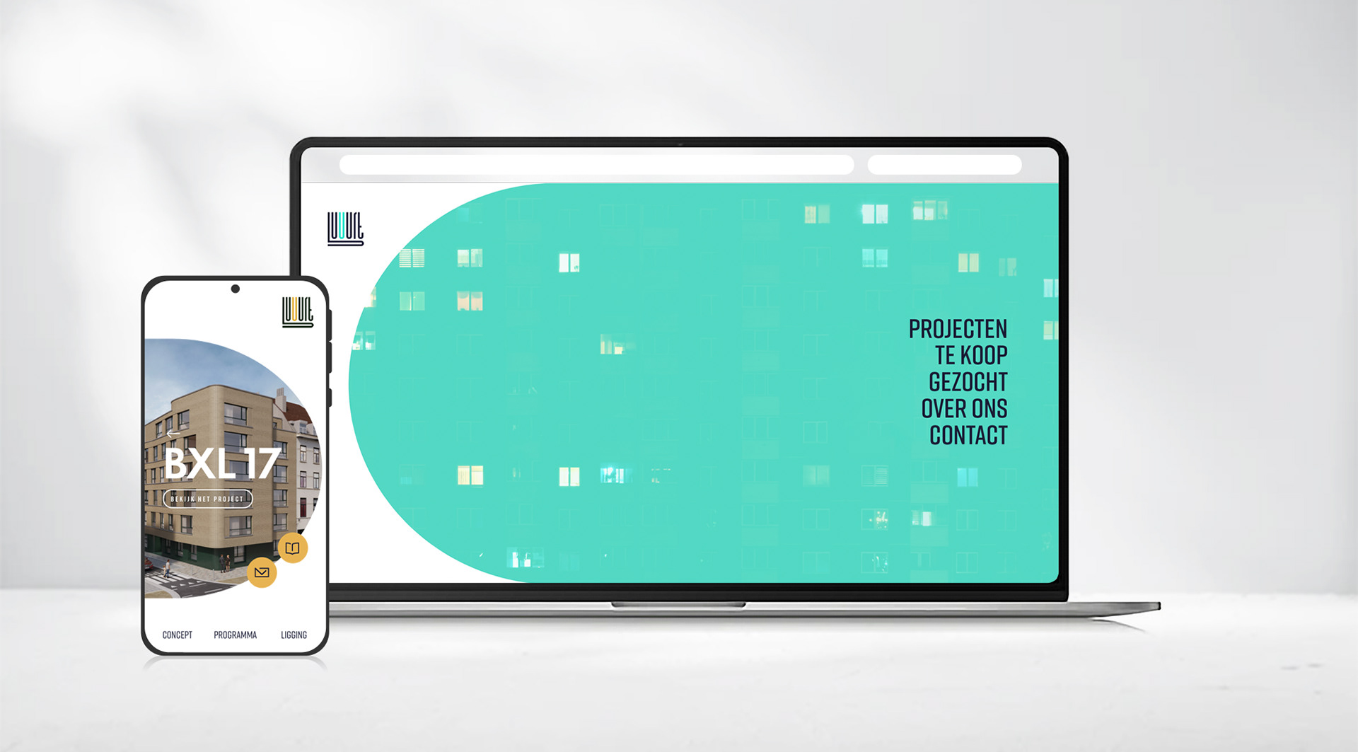
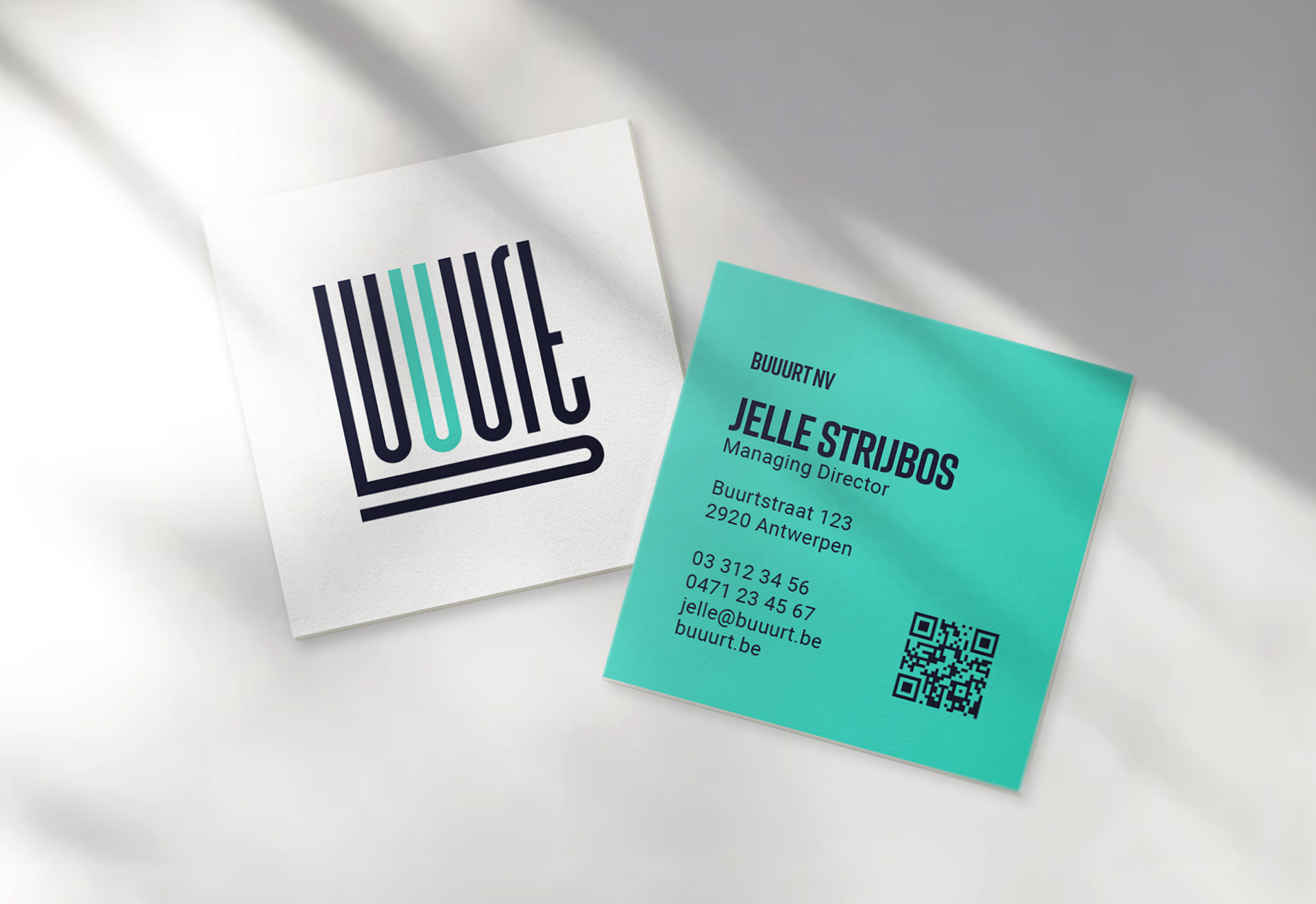
Buuurt is a residential developer. They 're goal is to built custom housing suited for every individual. Simply said: their focus is on you ('U' in dutch).
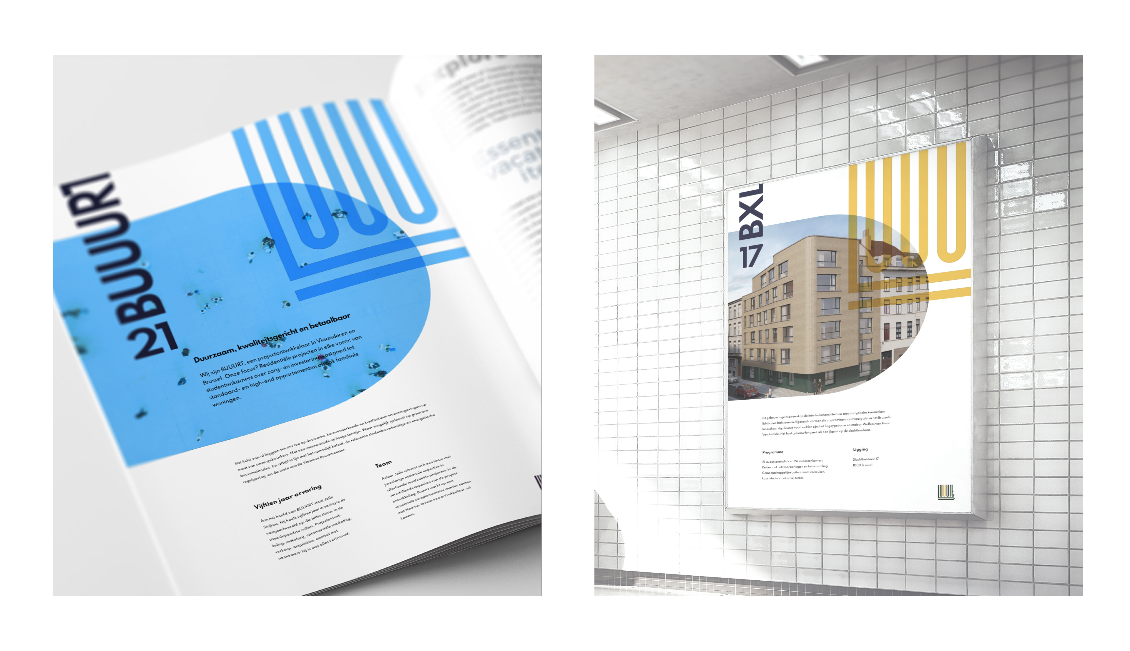
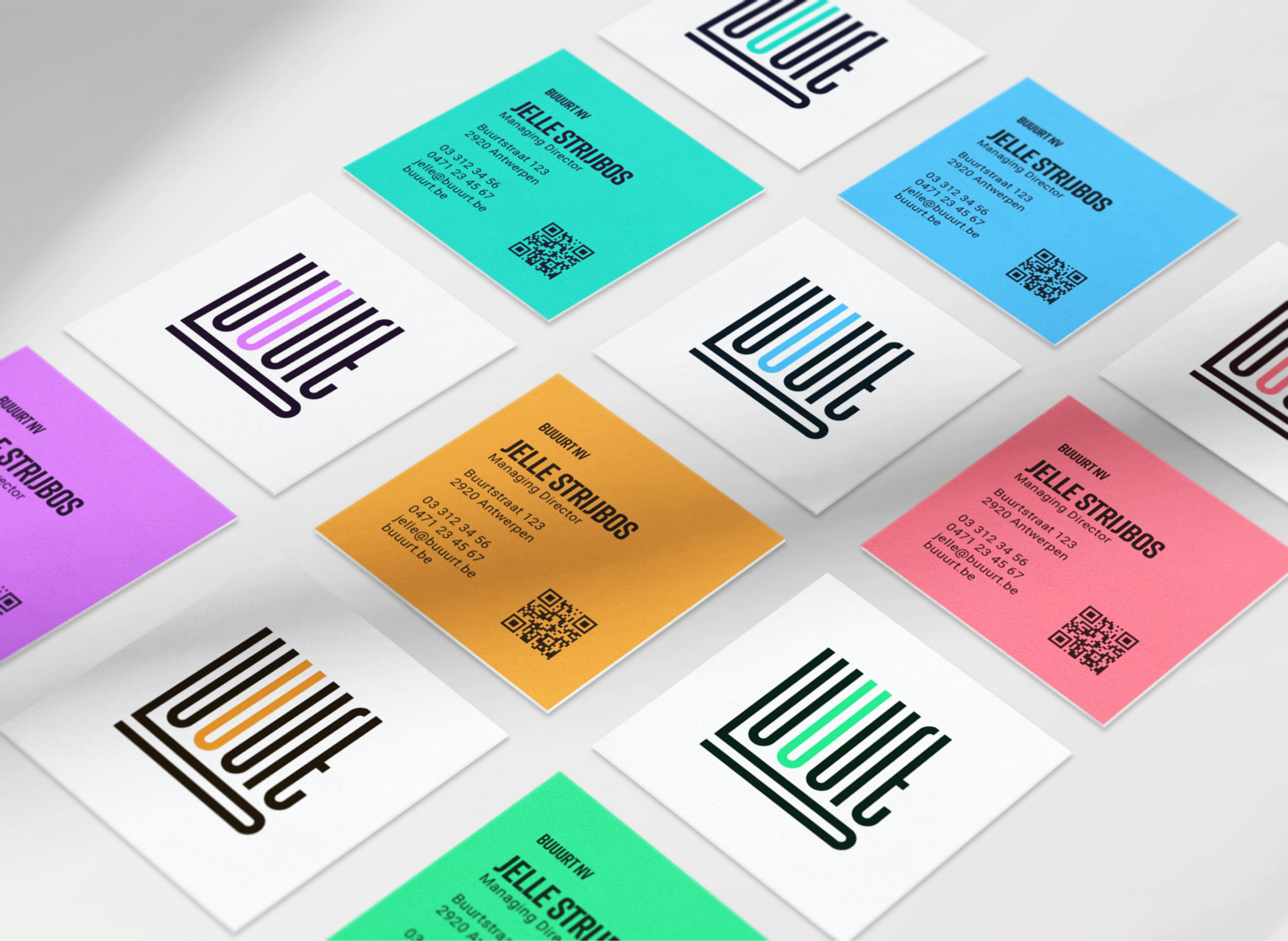
That same focus on "U" is literally applied to the logo. An extra "U" is added in the middle of the word "Buurt" which means neighbourhood in dutch.
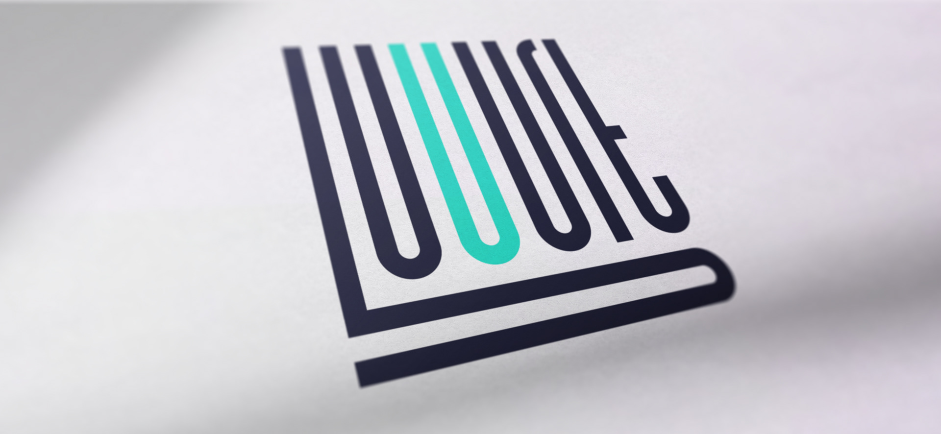
Logo
The raised letters resemble the streets on a roadmap, a small neighbourhood roadmap if you please.
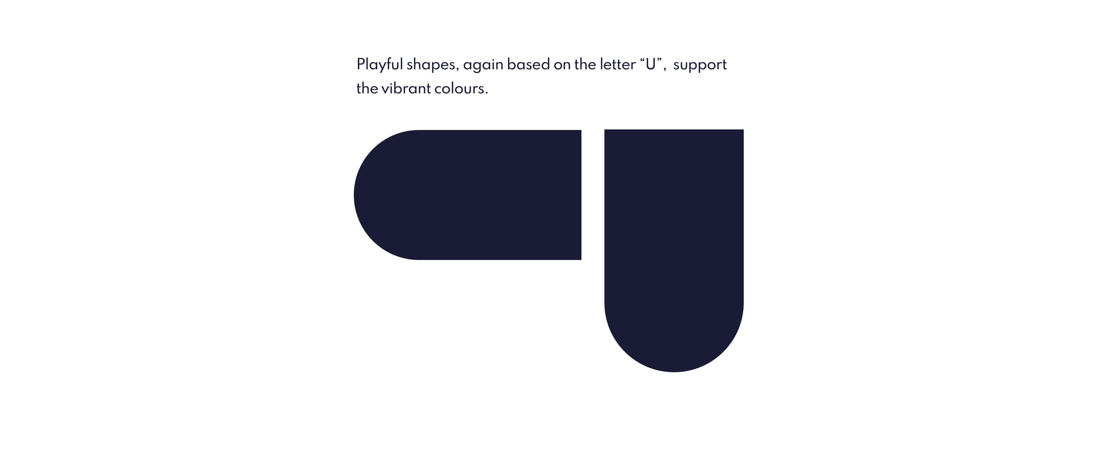
Every letter of the logotype is constructed with parts of the letter "U".
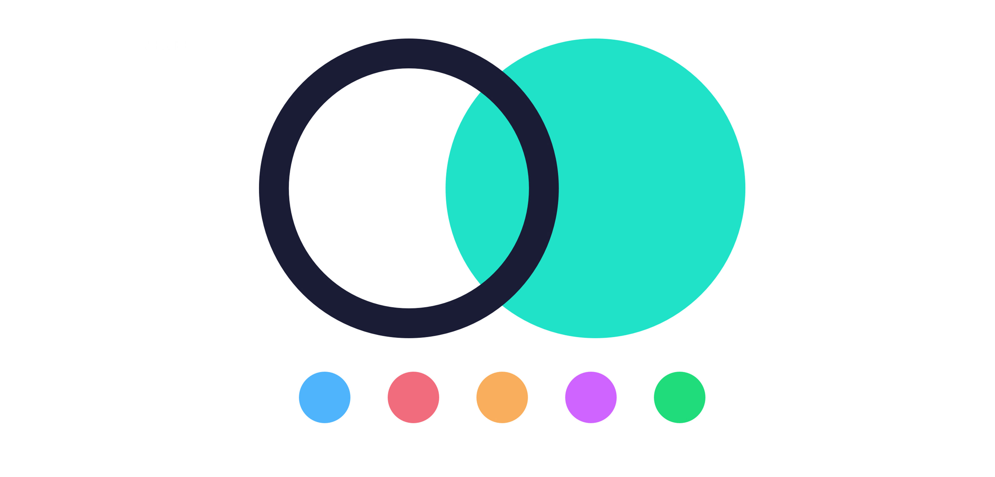
Colour pallet
The warm, welcoming and playful colours differentiate Buuurt from the main competitors in the high end residential development business.
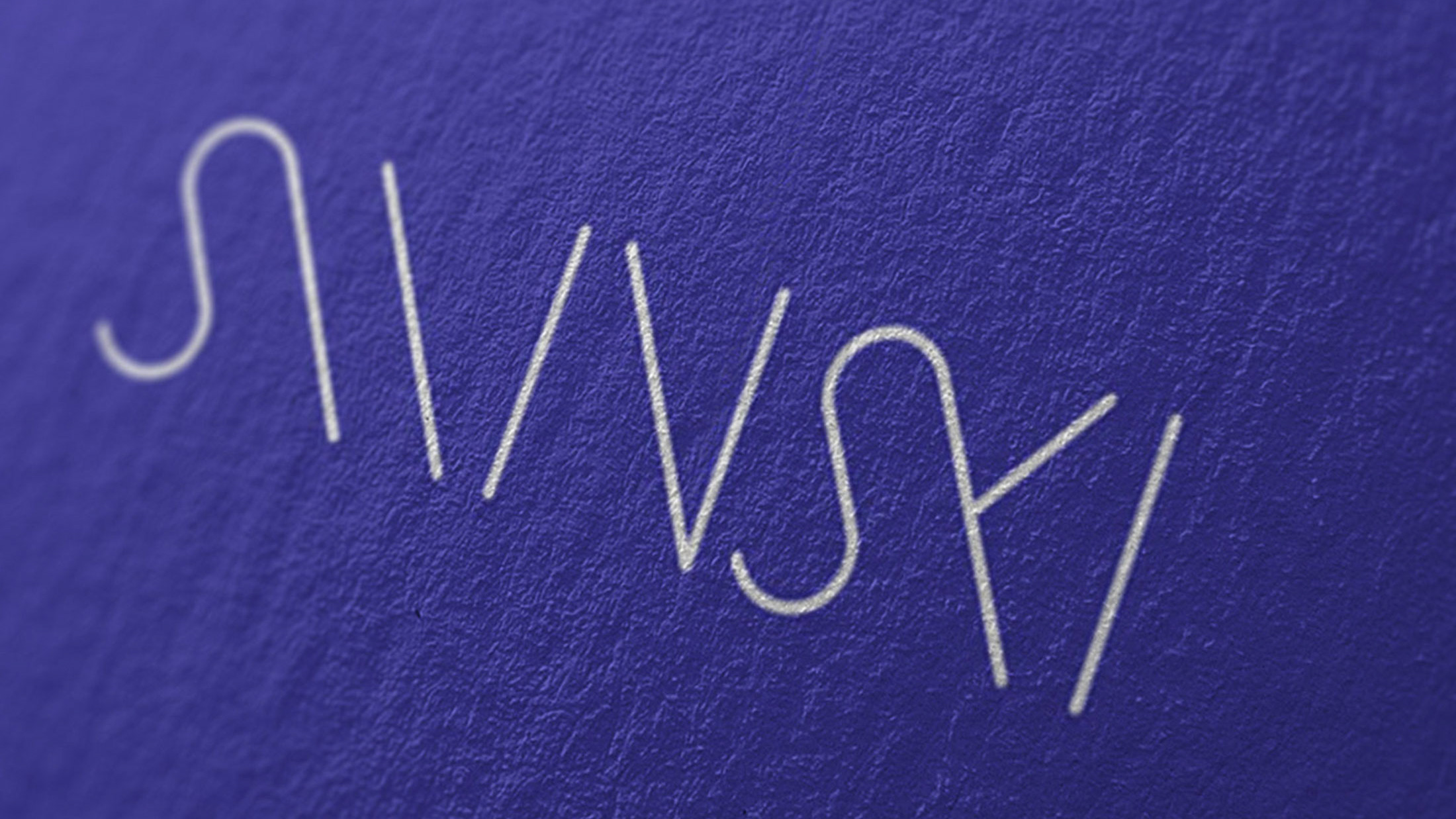
Typography
Shapes
Usage