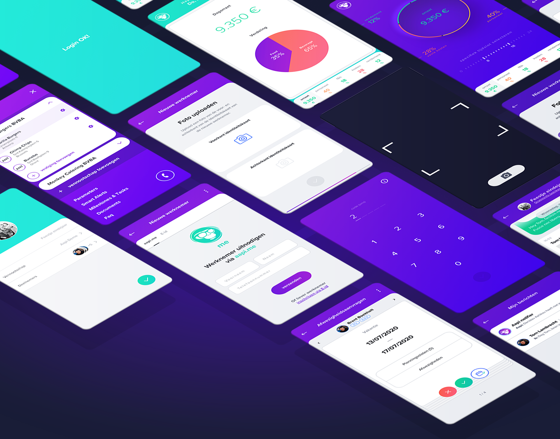
No more monkey business
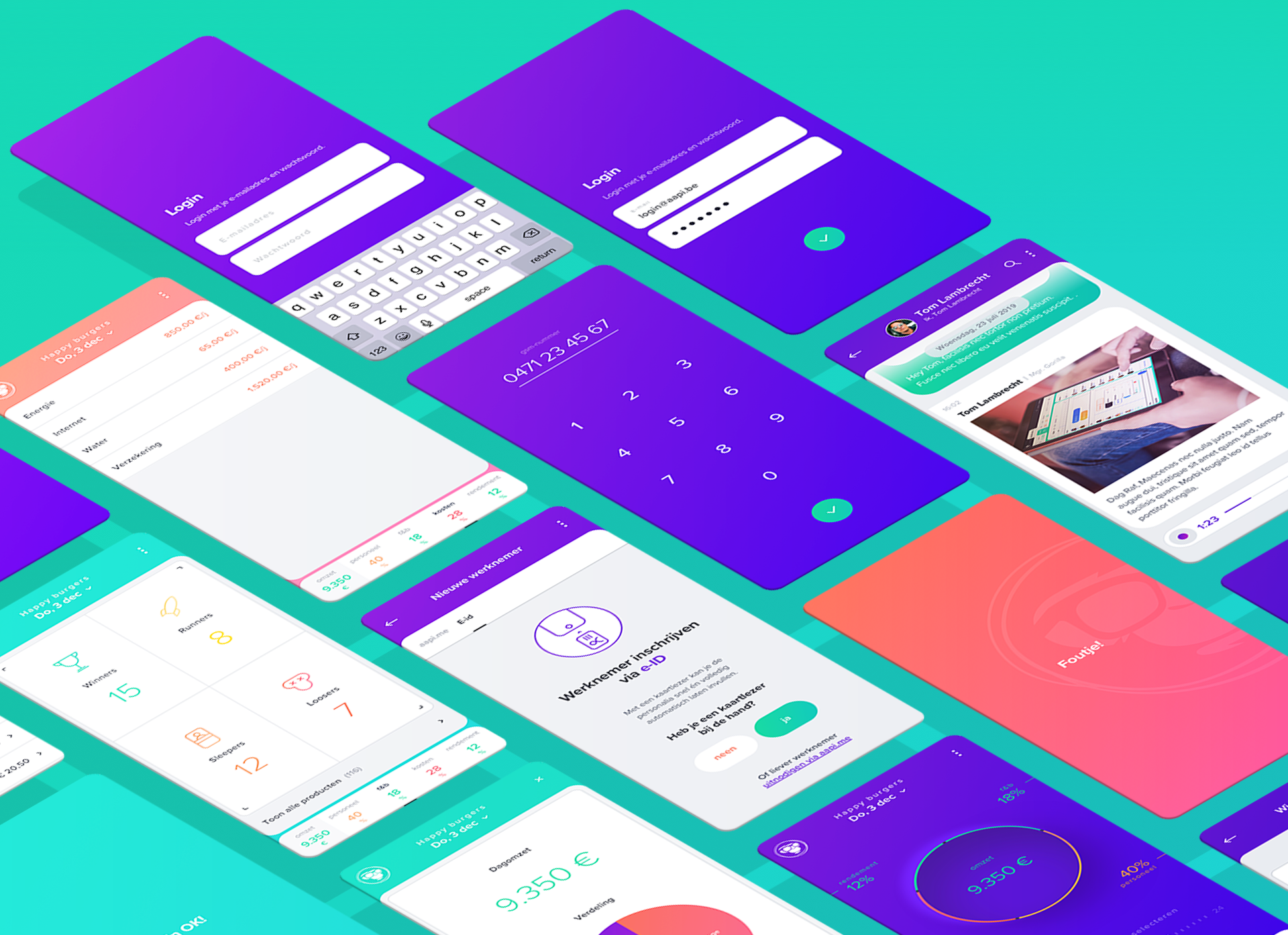
Aapi®-app is the base app for a range of innovative apps created by the aapi® team to eliminate all hassles and paperwork for Hospitality Business Owners.
The app assists the user in making the right decisions to make a profit. Whether it’s hiring the right people, getting rid of non profitable dishes on the menu or just deciding which are the ideal opening hours.
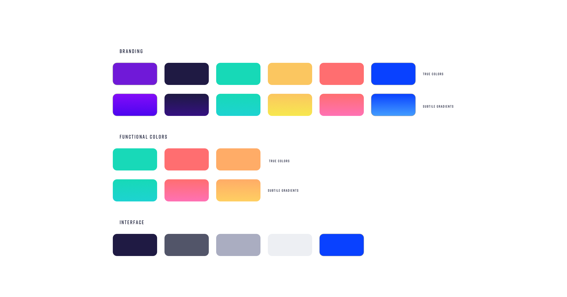
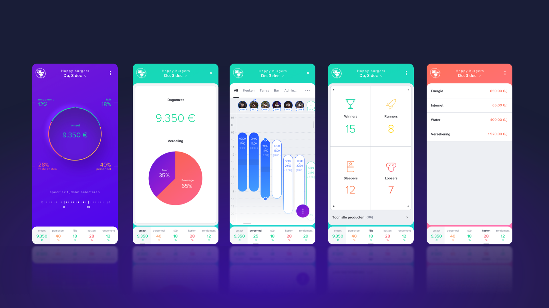
Colour scheme
The color scheming is divided in 3 categories:
Branding, functional and interface.
Branding, functional and interface.
Branding colors are the colors we defined for the corporate identity of aapi®. To make big monochromatic area’s a bit more interesting there’s a subtle gradient in it. We extended that concept in our app.
Functional colors are the colors we use to support the data we visualize. We want to add meaning to the raw data by adding color to them. In a blink of an eye the user knows how he ’s doing? Good (green), ok (orange) or not so good (red).
Interface colors are the colors which support the interface. Colors of lines, area’s, actions…
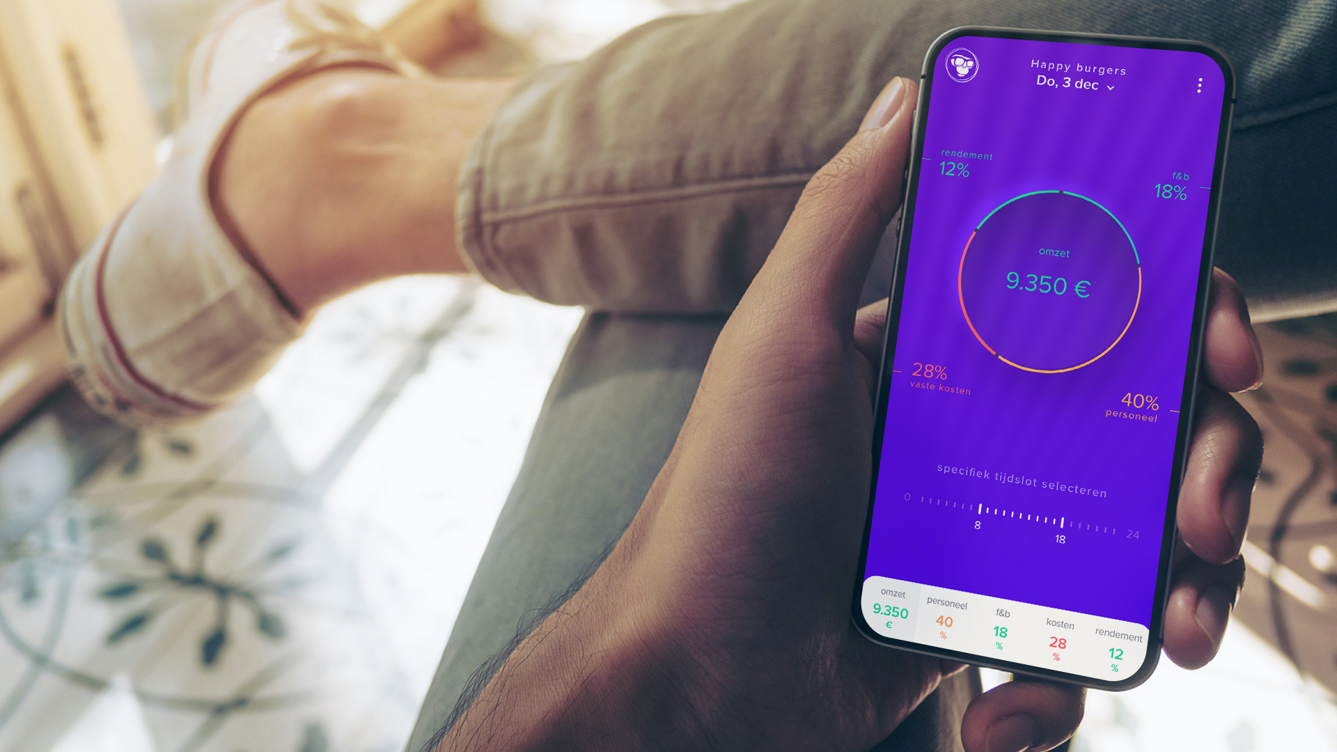
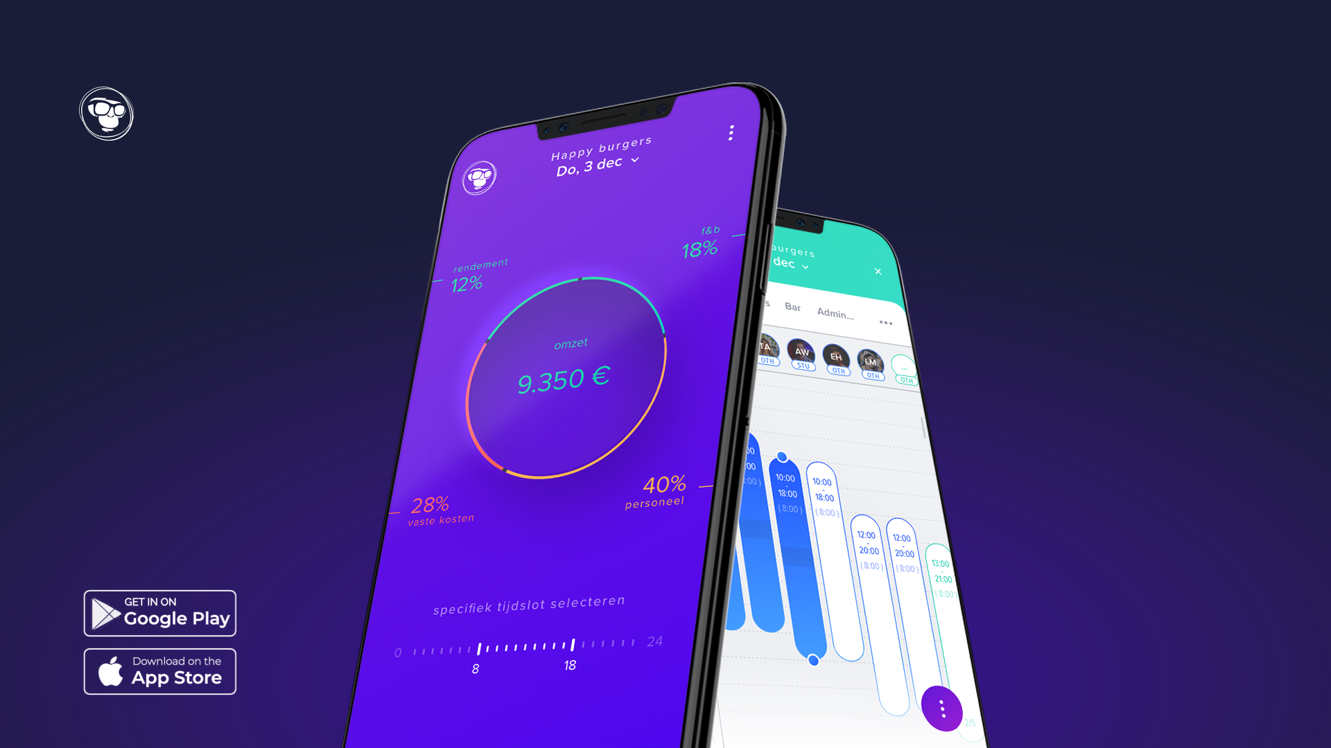
The Beating Heart of AAPI
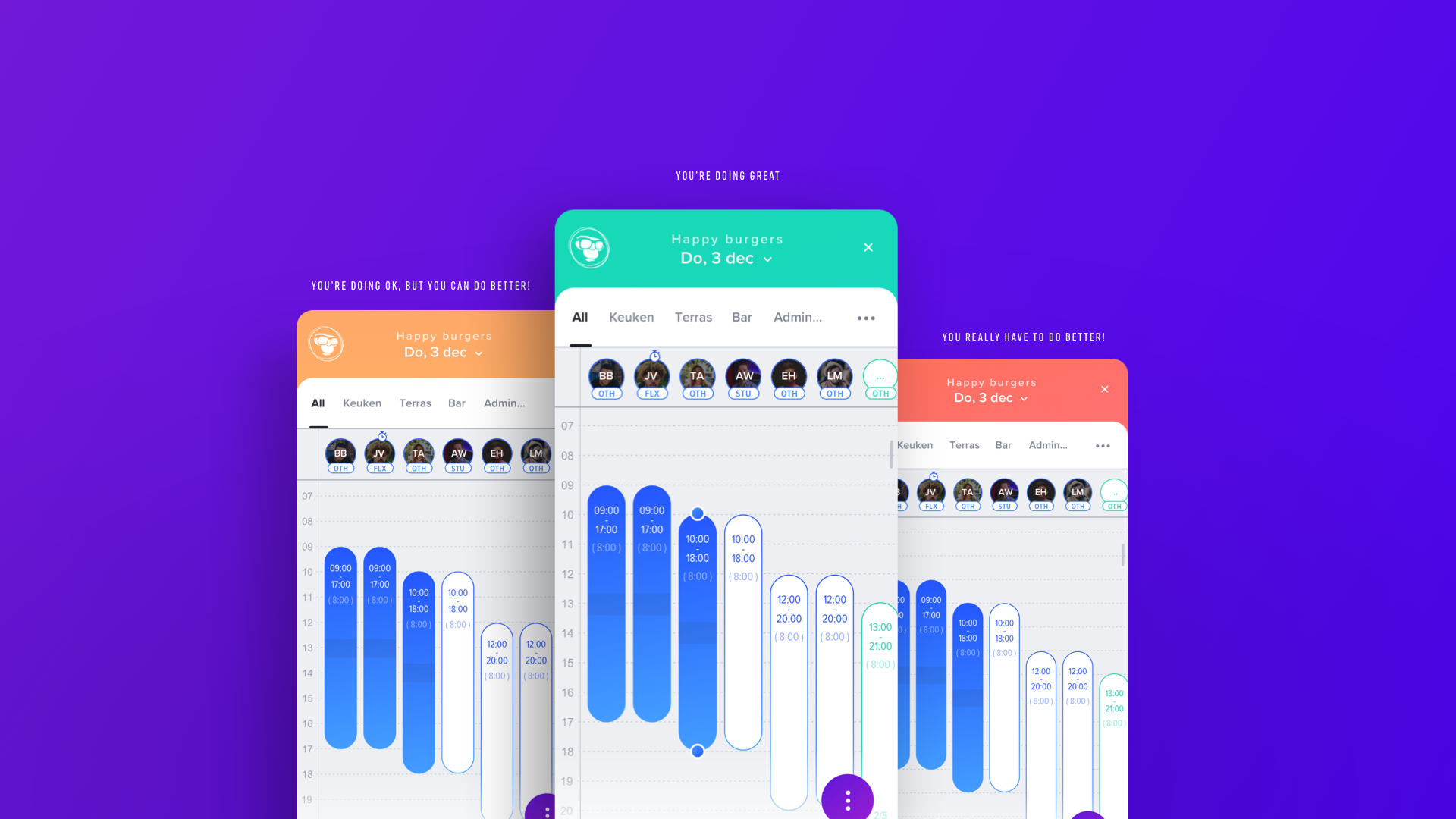
This is Aapi’s center of intelligence. This screen provides the users with a clear view on costs and benefits. Artificial intelligence is used to create benchmarks based on sector specific reference data and personal settings and goals. These benchmarks are compared in realtime to incoming data. This is visualized with a color reference: Green: you’re doing good! Yellow: you’re doing ok, but you can optimize things a bit, Orange: Optimisation is needed, Red: you're losing money redundantly. These references are linked to the back office where Aapi’s collaborators get an overview of which clients need support.
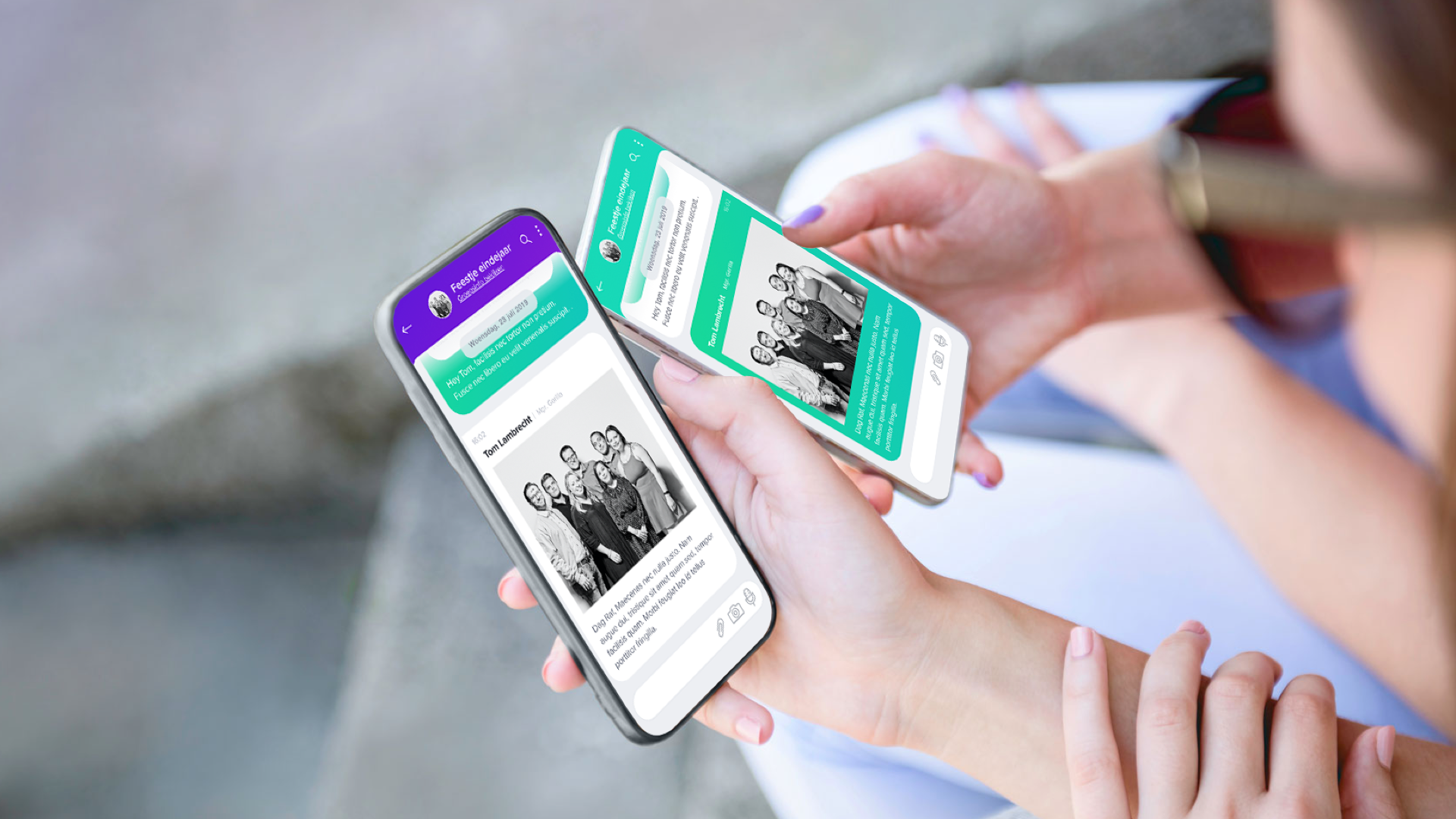
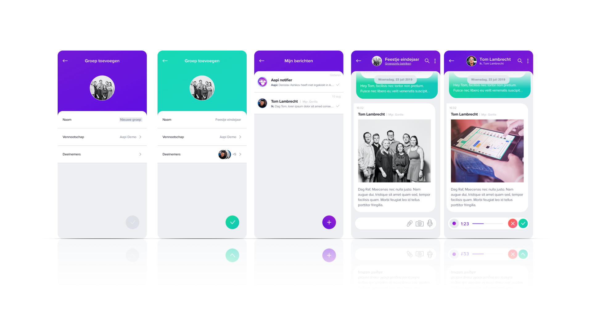
Internal communicationtool